Why Your YouTube Thumbnails Are Quietly Killing Your CTR

Creators Grid Team
August 13, 2026
According to YouTube Creator Insider data, over 90% of the top-performing videos across the platform rely on custom thumbnails rather than auto-generated frame captures. Yet thousands of creators publish polished, high-resolution graphics every single day only to watch their impression numbers flatline.
If your YouTube thumbnail CTR is hovering below 4%, the problem rarely stems from editing skill or graphic talent. Instead, thumbnails fail when they ignore visual hierarchy, create cognitive overload by repeating the title, or collapse into unreadable clutter on mobile screens where over 70% of YouTube consumption happens. A thumbnail's sole job is to spark curiosity and validate the promise made in your title within a split-second glance. When visual elements compete for attention instead of guiding the eye, impression-to-click conversion collapses immediately after publication.
The Mobile-Scale Trap: Designing for the Small Screen
Most thumbnails are designed on 27-inch desktop monitors in high-definition design software. At that scale, subtle text fonts, intricate background textures, and minor facial expressions look crisp and compelling.
However, when YouTube delivers that impression on a smartphone screen, your thumbnail shrinks to roughly the size of a postage stamp.
When viewed on a mobile feed, fine details blend into an unrecognizable blur. Intricate text becomes unreadable hieroglyphics, and complex multi-subject scenes turn into visual noise. If a viewer cannot decipher what your thumbnail represents in less than 300 milliseconds, they scroll past.
Calculating the Visual Density Ratio
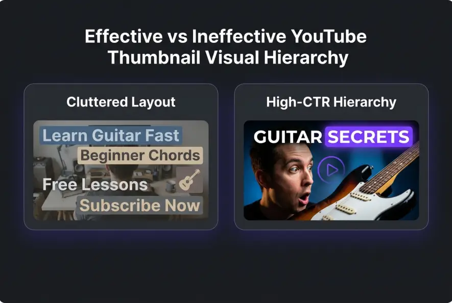
To prevent mobile scaling collapse, professional strategists evaluate visual density. Visual density refers to the number of distinct elements competing for a viewer's focal point within the frame.
- High visual density: Three facial cutouts, a full line of text, arrows, glowing borders, and a busy background.
- Low visual density: One central subject, high lighting contrast, and zero to two high-impact words.
When you simplify your canvas, you drastically increase visual clarity on mobile devices. Official YouTube thumbnail guidance repeatedly emphasizes that high-contrast, uncluttered framing yields higher engagement across small viewports.
Respecting the Interface Safe Zones
Another critical mobile mistake is ignoring YouTube's native UI overlays. Never place essential text, key facial features, or critical subject details in the bottom-right corner of your 16:9 canvas.
YouTube automatically overlays the video duration timestamp directly across the bottom-right corner on both mobile apps and desktop feeds. If your high-impact text or punchline sits behind that black timestamp box, it becomes completely unreadable, ruining your visual hook.
Keep all vital visual anchors centered or positioned across the top two-thirds of the frame to ensure zero interference from interface elements.
Before exporting your thumbnail, zoom out in your graphics editor to 10% scale or view it on your phone from arm's length. If you cannot identify the primary subject and emotion instantly, strip away at least two visual elements.
Why Text-Heavy Thumbnails Ruin Conversion
One of the most frequent mistakes creators make is treating the thumbnail as a visual repeat of the video title.
If your video title reads "How to Double Your YouTube Views in 30 Days," placing the exact text "Double Your Views in 30 Days" inside your thumbnail wastes half of your visual packaging real estate.
The Two-Second Reading Pattern
Viewers scan search results and browse feeds in a specific pattern. The eye hits the thumbnail image first to judge emotional resonance or visual intrigue, then drops down to scan the text title for context.
When both assets communicate identical phrasing, you miss the opportunity to create a cognitive gap. A cognitive gap occurs when the image and title present complementary pieces of a puzzle, forcing the viewer's brain to click to resolve the mystery.
Instead of repeating title phrasing, use thumbnail text to provide a short emotional punchline, an outcome teaser, or a stark contrast.
Typography Rules for Split-Second Readability
When you do choose to include text on a thumbnail, styling matters just as much as word choice. Selecting thin, cursive, or overly stylized fonts creates immediate visual strain on smaller devices.
Stick to heavy, bold, sans-serif typefaces like Impact, Montserrat Black, or Bebas Neue. Additionally, avoid subtle pastel text colors that blend into background imagery. Apply heavy dark drop shadows, solid color backing boxes, or high-contrast stroke outlines to separate text elements from underlying visual textures.
Redundant vs Complementary Thumbnail Frameworks
The table below illustrates how shifting from redundant text to complementary visual framing creates curiosity and drives higher engagement across browse feeds.
| Video Topic | Redundant Thumbnail Text | Complementary Thumbnail Text | Visual Focus |
|---|---|---|---|
| Channel Growth Strategy | "How to Get 10k Subscribers" | "The Secret Pivot" | Side-by-side analytics chart spiking upwards |
| Video Editing Tutorial | "Edit Videos 2x Faster" | "Stop Doing This" | Split screen showing slow rendering vs instant output |
| Gear Review | "Sony A7IV Full Review" | "Don't Buy Yet" | Close-up expressive face holding camera with warning icon |
| Productivity Workflow | "How I Plan My Content" | "Zero Stress" | Desk setup with clean digital calendar overlay |
Harnessing Contrast and Focal Point Isolation
Visual contrast is the primary mechanism that pulls a viewer's eye out of the scroll feed. Without strong tonal or color contrast, your thumbnail blends into the surrounding light or dark mode UI of YouTube.
The Rule of Primary Subject Isolation
To make your thumbnail pop, the primary subject must stand out sharply against the background. You can achieve subject isolation using three specific visual techniques:
- Luminance Contrast: Position a bright subject against a dark background, or a dark silhouetted subject against a luminous backdrop.
- Color Separation: Utilize complementary color wheels. Placing warm tones like orange, red, or yellow against cool background hues like deep navy, slate gray, or dark violet creates natural depth.
- Depth Blur (Bokeh): Apply artificial background blur to force the viewer's gaze onto the sharp foreground element.
When visual elements share similar brightness levels or color values, the eye finds no clear entry point. Understanding how the algorithm reacts to a declining YouTube thumbnail CTR is crucial, as low contrast causes viewers to skip your impression entirely.
Avoid using saturated primary yellow, bright red, or white backgrounds across the entire frame. These colors clash with YouTube's native desktop and mobile interface elements, making your thumbnail look cheap rather than premium.
The Role of Facial Expressions and Gaze Direction
Human brains are hardwired to detect and interpret human faces. Incorporating a clear face into your thumbnail can significantly increase click propensity, but only if the emotion aligns with the video's core promise.
Generic exaggerated "shocked faces" have lost effectiveness due to audience fatigue. Viewers recognize over-the-top open-mouth expressions as low-effort clickbait.
Instead, aim for genuine, nuanced emotion: curiosity, intense focus, mild skepticism, or relief. Furthermore, pay close attention to gaze direction. If the subject in your thumbnail looks directly at the viewer, it creates immediate intimacy. If the subject looks at a specific visual element or text callout within the thumbnail, the viewer's eye will naturally follow that line of sight to inspect the object.
Lighting and Background Atmosphere
Background selection sets the mood before a viewer reads a single word. Dark, moody, high-contrast backgrounds consistently outperform washed-out or flat studio backgrounds in tech, finance, and educational niches.
Adding subtle directional rim lighting—such as a vibrant backlight hugging your primary subject's shoulders—creates immediate separation from dark backdrops. This lighting trick instantly elevated amateur channel thumbnails into professional-grade assets that command authority in search feeds.
Testing and Optimizing Your Visual Concepts
Designing a great thumbnail is only half the battle; verifying its performance with empirical data completes the process.
Relying purely on personal preference often leads to blind spots. What looks visually appealing to you as a creator may fail to resonate with cold audiences browsing the platform.
Running Systematic Thumbnail Experiments
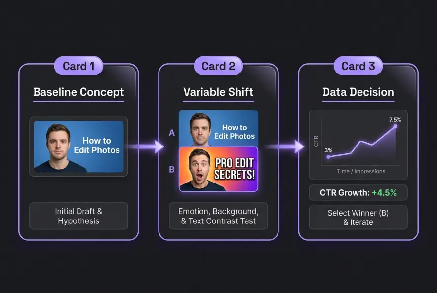
Modern platform tools allow creators to test multiple visual angles scientifically. Using the built-in YouTube Test & Compare tool, you can upload up to three thumbnail variations for a single video.
YouTube then distributes these variations evenly across similar viewer segments until a statistically significant winner emerges based on watch time share and click conversion. A steady YouTube thumbnail CTR above 6% signals to the algorithm that your content satisfies viewer expectations across broader recommendations.
When setting up a thumbnail split test, avoid testing minor tweaks like changing a font color from white to yellow. Instead, test distinct visual concepts:
- Concept A: Human face with an expressive emotional reaction.
- Concept B: Object-focused macro shot emphasizing product detail or result.
- Concept C: Graphic illustration showing a dramatic before-and-after transformation.
Testing wildly different visual frameworks provides actionable intelligence about what truly drives your target audience to click.
Tracking Impression Decay and Iteration Timing
A thumbnail's performance changes across a video's lifecycle. During the initial publish window, YouTube serves your video to your core subscribers and returning viewers. This group knows your content quality, resulting in naturally higher baseline click rates.
As YouTube expands distribution to broader, colder browse audiences, your click-through rate will naturally taper off.
Monitoring your analytics inside YouTube Studio during the first 48 hours reveals critical performance signals. If your impression count spikes while your click conversion drops precipitously below 2%, your thumbnail is failing to persuade non-subscribers.
High CTR on low impressions is easy to achieve; maintaining strong click rates as YouTube pushes your video to tens of thousands of cold impressions is the true test of packaging.
Swapping in a secondary, simplified thumbnail variant during this window can reignite distribution and pull the video out of an algorithmic slump. If you are looking to streamline your broader content publishing workflow after mastering visual packaging, explore our complete guide on repurposing video content.
The 4-Step Actionable Thumbnail Optimization Checklist
To ensure every video launch reaches its maximum audience potential, implement this concise checklist before hitting publish on your next upload:
- Mobile Legibility Check: Verify that all visual assets and text are instantly readable at 10% display scale.
- Contextual Curiosity Gap: Confirm that your thumbnail graphic complements your title rather than copying its phrasing word-for-word.
- Focal Point Dominance: Ensure one central subject commands immediate attention using clear color contrast or lighting separation.
- Strategic A/B Preparation: Prepare at least two distinct thumbnail concepts ready for live testing in YouTube Studio.
By treating your thumbnail as a dedicated micro-advertisement rather than an afterthought, you eliminate the visual friction stopping potential viewers from clicking. Consistently refining your visual packaging establishes strong click signals, enabling YouTube's recommendation engine to find and deliver your ideal audience month after month.
Creators Grid Team
Empowering creators.
Actionable insights, strategies, and tools for the next generation of digital creators.
Frequently Asked Questions
For most niches, a baseline YouTube thumbnail CTR between 4% and 7% is healthy. New channels often see higher initial variance because YouTube is still determining the video's ideal audience demographic.
Not necessarily. While human faces evoke natural empathy, face-less thumbnails perform exceptionally well in tutorials, tech reviews, and gaming when a high-contrast object or dramatic transformation serves as the primary focal point.
YouTube's recommendation system usually reflects thumbnail changes within 2 to 24 hours. However, evaluating significant CTR swings requires at least 1,000 new impressions post-swap.
Resolution itself does not directly dictate ranking algorithms, but uploading at 1280x720 (or 1920x1080) ensures crisp rendering on retina mobile screens, preventing blurriness that causes viewers to scroll past.
Yes, updating thumbnails on evergreen catalog videos is one of the fastest ways to revive dormant impressions and re-trigger algorithmic recommendations without re-editing the content.